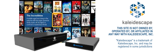
• Thanks for visiting the Kaleidescape Owners' Forum

    This forum is for the community of Kaleidescape owners, and others interested in learning about the system, equipment, services, and the company itself.

    It is run by a group of enthusiastic Kaleidescape owners and dealers purely as a service to this community.

    This board is not affiliated in any way with Kaleidescape, Inc.
    For official technical support, product information, or customer service, please visit www.kaleidescape.com

  • You are currently in "Guest" mode and not logged in with a registered account.

    The forum is free to use and most of the forum can be used by guests who are not registered....

    ... but we strongly encourage you to register for a full account. There is no cost to register for a full account.

    Benefits of registering for a full account:

    • Participate in the discussions! You must have a registered account to make posts on the forums. You will be able to start your own thread on a topic or question, or you can reply to other threads/discussions.
    • Use the "Conversation" feature (known as "private messaging" on other forums) to communicate directly with any of the other users here.
    • Access the Files area. The "resources" area of the forum contains many "Favorite Scene" and Script files that can dramatically increase the enjoyment of your Kaleidescape system. Go directly to great scenes in your favorite movies, created by other owners, and add automation to playback of your system with Scripts.
    • You won't see this annoying notice at the top of every screen!😊

    It's easy and free to register for the forum. Just click the "Register" button in the upper right corner of this page, and follow the instructions there.

Does the Kaleidescape UI look dated?

josh

Administrator
Staff member
Forum Administrator
Moderator
⭐️⭐️PATRON⭐️⭐️
Maybe I'm the only one, but let's ask and see...

Does anyone else think the Kaleidescape UI is starting to desperately need an overhaul? I don't want to ignore how well it was designed, and how well everything works, but the UI is starting to look awfully dated to me.

In this age of iTunes/ipod Coverflow, Vudu, and even some (gasp) Media Center applications, the Kaleidescape UI certainly doesn't wow anyone any more... it's kinda "flat", rather plain. It doesn't even work well in some spots (hold down-arrow through a large collection of movies and the covers just stop appearing along the right side- the hardware just can't keep up).

It also seems to have just not been designed to handle more than a few collections, or more than about 40-50 favorite scenes. Very cumbersome for larger collections. (see threads elsewhere here on the forum).

While it all works well, it just doesn't seem leading edge, nor worthy of a contemporary system at this very high price point. It seems very 1990s.

I bet there are some great UI people at Kaleidescape (and elsewhere) who would just love to rethink the whole thing and bring the system back up to being absolute state-of-the-art in terms of the user experience.

... or do others feel that plain-but-solid/tested beats flashy any day?

--josh
 
I don't think so. I think the rest of the industry is just now catching up to K's UI. I'm a believer in there's always room for improvement in anything so I am sure there are places here that could be tweaked.
 
I'm of two minds about it. On the one hand, eye candy is nice. It adds to the "Wow factor". There's nothing quite so exciting as getting a software update and discovering all kinds of new geegaws and whatsits have been implemented.

But on the other hand, I look at what the purpose of the Kaleidescape system is and I think that simple is better. Let me twist your question for a moment and pose one of my own:

How many people actually use the Cover View to find what they want to watch? Sure, I flip to Cover View when I'm demoing the system to people and they think it's pretty neat but honestly: once you've got more than a few hundred movies and/or albums imported onto the system, the Cover View is not so practical.

Once your collection starts to grow, the List View really starts to show it's power. Need to sort by Genre? Move the highlight to that column and press Select. The sorting is instantaneous. With a touch panel, I can jump to a specific letter almost instantly or search for a specific title, actor, director or whatever. I can even find a movie based on how much time I have to watch it.

Bottom line, for me, is that the interface is simple and fast and it doesn't get in the way of what the system is for: to allow me to watch my movies and TV shows.

I do agree, though, that there are some tweaks and polishes that need to be addressed (especially in the Collections views).

Disclaimer: My opinion of the interface may be somewhat biased.
 
I almost never use cover view, for the reasons you state. But seeing cover art is often a faster view to finding a movie I want than a list... so I don't really use List view very much either unless I'm after a particular genre or want to sort by an actor (rare). I use collections view for almost everything... and have had to make a collection called "All Movies" so i can scroll through all my movies with cover art.

So I see your guys points, but still feel the whole thing is too flat and old looking.
 
Josh and i had this exact discussion about 2 years ago.

While the overall look and feel of the UI still is standard setting ( i feel) i defintely hear josh on giving it more spit and polish. some more 3D feel, things like that.

they have a guy there now doing user experience stuff that used to work at Nvidia and i would hazard a guess he is looking into this exact area.

Also the way k works, nobody would ever add something to just add something. keep to the core values which were simplicity and fast. having said that, it is a UI that is about 6-7 years old. so jazzing it up a bit would be nice. it will not really get anymore new customers, but it might garner a bit more attention and make the existing customers not compare it to a cell phone :) sorry josh, couldn't resist.
 
Maybe because I've only had a kscape for 9 months, but the UI is still very nice to me.

How many people actually use the Cover View to find what they want to watch?

I still do often, mainly because of the whole resorting similar movies. I can usually spot a movie I wanna see, or a movie close to a movie I want to see and just let it rearrange.

I won't lie and say I never use listmode though... sometimes it's the fastest way to get to the exact movie/album you're looking for
 
I like the current UI

I like the current UI. I am sure the smart folks at K will come up with improvements down the road, but I like the keep it simple approach. I like browsing the covers as a way to just scan through, somewhat randomly, the movies I have. If I have a particular movie I am looking for, I find the list view pretty workable. I have programmed in search and jump functionality into my AMX remote, so getting to a title or actor is pretty quick. I am not using collections as much as I should. Mainly to add movies in the web interface to the "watch soon" collection. Anyway, don't fix what isn't broken.
 
If they jazz up the interface, that is cool, but you don't want to change things so much you have to relearn the system. Sure, it is simple but even changing one simple thing to another different simple thing just gets confusing.

They could update the graphics a bit but the most important things are ease of use and performance. They cannot screw up either of those for a prettier interface or it will be a losing deal for them.

Also, I don't think my iPod is any better when I have 500 albums to go through. Managing very large collections is just cumbersome no matter what interface you slap on it. Both the iPod and the Kaleidescape are a lot better than the old card catalog and Dewey Decimal System.
 
Back
Top